PyBroom Example - Multiple Datasets - Scipy Robust Fit
This notebook is part of pybroom.
This notebook demonstrate using pybroom when fitting a set of curves (curve fitting) using robust fitting and scipy. We will show that pybroom greatly simplifies comparing, filtering and plotting fit results from multiple datasets. See pybroom-example-multi-datasets for an example usinglmfit.Modelinstead of directly scipy.
In [1]:
%matplotlib inline
%config InlineBackend.figure_format='retina'  # for hi-dpi displays
import numpy as np
import pandas as pd
import matplotlib.pyplot as plt
from matplotlib.pylab import normpdf
import seaborn as sns
from lmfit import Model
import lmfit
print('lmfit: %s' % lmfit.__version__)
lmfit: 0.9.7
/home/docs/checkouts/readthedocs.org/user_builds/pybroom/envs/latest/lib/python3.5/site-packages/IPython/html.py:14: ShimWarning: The `IPython.html` package has been deprecated since IPython 4.0. You should import from `notebook` instead. `IPython.html.widgets` has moved to `ipywidgets`.
  "`IPython.html.widgets` has moved to `ipywidgets`.", ShimWarning)
In [2]:
sns.set_style('whitegrid')
In [3]:
import pybroom as br
Create Noisy Data
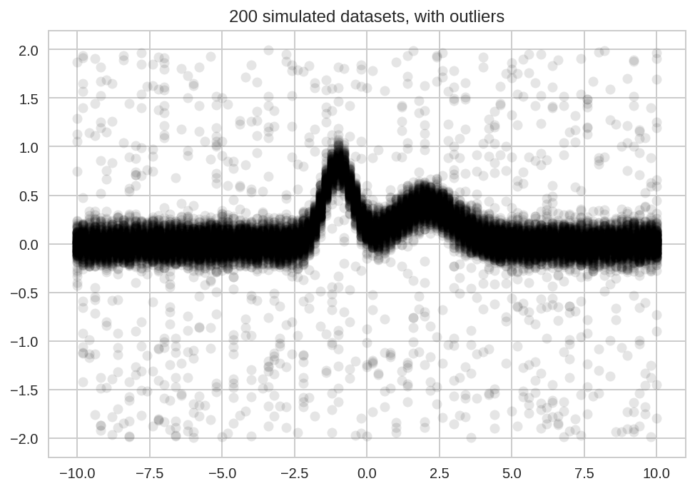
We start simulating N datasets which are identical except for the additive noise.
In [4]:
N = 200
In [5]:
x = np.linspace(-10, 10, 101)
In [6]:
peak1 = lmfit.models.GaussianModel(prefix='p1_')
peak2 = lmfit.models.GaussianModel(prefix='p2_')
model = peak1 + peak2
In [7]:
#params = model.make_params(p1_amplitude=1.5, p2_amplitude=1,
#                           p1_sigma=1, p2_sigma=1)
In [8]:
Y_data = np.zeros((N, x.size))
Y_data.shape, x.shape
Out[8]:
((200, 101), (101,))
In [9]:
for i in range(Y_data.shape[0]):
    Y_data[i] = model.eval(x=x, p1_center=-1, p2_center=2,
                           p1_sigma=0.5, p2_sigma=1,
                           p1_height=1, p2_height=0.5)
Y_data += np.random.randn(*Y_data.shape)/10
Add some outliers:
In [10]:
num_outliers = int(Y_data.size * 0.05)
idx_ol = np.random.randint(low=0, high=Y_data.size, size=num_outliers)
Y_data.reshape(-1)[idx_ol] = (np.random.rand(num_outliers) - 0.5)*4
In [11]:
plt.plot(x, Y_data.T, 'ok', alpha=0.1);
plt.title('%d simulated datasets, with outliers' % N);
Model Fitting
curve_fit()
In [12]:
import scipy.optimize as so
In [13]:
from collections import namedtuple
In [14]:
# Model PDF to be maximized
def model_pdf(x, a1, a2, mu1, mu2, sig1, sig2):
    return (a1 * normpdf(x, mu1, sig1) +
            a2 * normpdf(x, mu2, sig2))
In [15]:
result = so.curve_fit(model_pdf, x, Y_data[0])
In [16]:
type(result), type(result[0]), type(result[1])
Out[16]:
(tuple, numpy.ndarray, numpy.ndarray)
In [17]:
result[0]
Out[17]:
array([-78.4614667 ,  79.86148065,   0.57794997,   0.55011357,
         2.72486907,   2.68560732])
Using a namedtuple is a clean way to assign names to an array of
paramenters:
In [18]:
Params = namedtuple('Params', 'a1 a2 mu1 mu2 sig1 sig2')
In [19]:
p = Params(*result[0])
p
Out[19]:
Params(a1=-78.461466697535982, a2=79.861480653573466, mu1=0.57794997389970038, mu2=0.55011356664998978, sig1=2.7248690687725547, sig2=2.6856073193947658)
Unfortunately, not much data is returned by curve_fit, a 2-element
tuple with:
- array of best-fit parameters
- array of jacobian
Therefore curve_fit is not very useful for detailed comparison of
fit results. A better interface for curve fitting would be lmfit.Model
(see this other notebook).
In the current notebook we keep exploring further options offered by
scipy.optimize.
least_squares()
As an example, we use the least_squares function which supports
robust loss functions and constraints.
We need to define the residuals:
In [20]:
def residuals(p, x, y):
    return y - model_pdf(x, *p)
Then, we fit the N datasets with different loss functions storing result in a dict containing lists:
In [21]:
losses = ('linear', 'huber', 'cauchy')
Results = {}
for loss in losses:
    Results[loss] = [so.least_squares(residuals, (1,1,0,1,1,1), args=(x, y), loss=loss, f_scale=0.5)
                     for y in Y_data]
In [22]:
# result = Results['cauchy'][0]
# for k in result.keys():
#     print(k, type(result[k]))
Tidying the results
Now we tidy the results, combining the results for the different loss functions in a single DataFrames.
We start with the glance function, which returns one row per fit
result:
In [23]:
dg_tot = br.glance(Results, var_names=['loss', 'dataset'])
dg_tot.head()
Out[23]:
| success | cost | optimality | nfev | njev | message | dataset | loss | |
|---|---|---|---|---|---|---|---|---|
| 0 | True | 1.955439 | 0.000046 | 19 | 19 | `ftol` termination condition is satisfied. | 0 | cauchy |
| 1 | True | 1.575721 | 0.000041 | 14 | 13 | `ftol` termination condition is satisfied. | 1 | cauchy |
| 2 | True | 1.698535 | 0.000048 | 17 | 15 | `ftol` termination condition is satisfied. | 2 | cauchy |
| 3 | True | 0.647067 | 0.000010 | 14 | 13 | `ftol` termination condition is satisfied. | 3 | cauchy |
| 4 | True | 0.582303 | 0.000023 | 16 | 14 | `ftol` termination condition is satisfied. | 4 | cauchy |
In [24]:
dg_tot.success.all()
Out[24]:
True
Then we apply tidy, which returns one row per parameter.
Since the object OptimzeResult returned by scipy.optimize does
only contains an array of parameters, we need to pass the names as as
additional argument:
In [25]:
pnames = 'a1 a2 mu1 mu2 sig1 sig2'
dt_tot = br.tidy(Results, var_names=['loss', 'dataset'], param_names=pnames)
dt_tot.head()
Out[25]:
| name | value | grad | active_mask | dataset | loss | |
|---|---|---|---|---|---|---|
| 0 | a1 | 1.301576 | -1.546049e-06 | 0.0 | 0 | cauchy |
| 1 | a2 | 0.850211 | 4.975275e-07 | 0.0 | 0 | cauchy |
| 2 | mu1 | -0.871609 | -2.283625e-05 | 0.0 | 0 | cauchy |
| 3 | mu2 | 1.918351 | -3.663978e-06 | 0.0 | 0 | cauchy |
| 4 | sig1 | 0.687056 | -1.893093e-05 | 0.0 | 0 | cauchy |
Finally, we cannot apply the augment function, since the
OptimizeResult object does not include much per-data-point
information (it may contain the array of residuals).
Plots
First we plot the peak position and sigmas distributions:
In [26]:
kws = dict(bins = np.arange(-2, 4, 0.1), histtype='step', lw=2)
for loss in losses:
    dt_tot.query('(name == "mu1" or name == "mu2") and loss == "%s"' % loss)['value'].hist(label=loss, **kws)
    kws['ax'] = plt.gca()
plt.title(' Distribution of peaks centers')
plt.legend();
In [27]:
kws = dict(bins = np.arange(0, 4, 0.1), histtype='step', lw=2)
for loss in losses:
    dt_tot.query('(name == "sig1" or name == "sig2") and loss == "%s"' % loss)['value'].hist(label=loss, **kws)
    kws['ax'] = plt.gca()
plt.title(' Distribution of peaks sigmas')
plt.legend();
A more complete overview for all the fit paramenters can be obtained with a factorplot:
In [28]:
sns.factorplot(x='loss', y='value', data=dt_tot, col='name', hue='loss',
               col_wrap=4, kind='box', sharey=False);
From all the previous plots we see that, as espected, using robust
fitting with higher damping of outlier (i.e. cauchy vs huber or
linear) results in more accurate fit results.
Finally, we can have a peek at the comparison of raw data and fitted models for a few datatsets.
Since OptimizeResults does not include “augmented” data we need to
generate these data by evaluating the model with the best-fit
parameters. We use seaborn’s FacetGrid, passing a custom function
_plot for model evaluation:
In [29]:
def _plot(names, values, x, label=None, color=None):
    df = pd.concat([names, values], axis=1)
    kw_pars = br.tidy_to_dict(df)
    y = model_pdf(x, **kw_pars)
    plt.plot(x, y, lw=2, color=color, label=label)
In [30]:
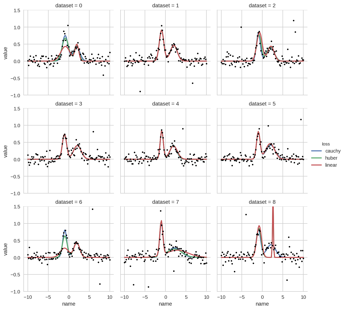
grid = sns.FacetGrid(dt_tot.query('dataset < 9'), col='dataset', hue='loss', col_wrap=3)
grid.map(_plot, 'name', 'value', x=x)
grid.add_legend()
for i, ax in enumerate(grid.axes):
    ax.plot(x, Y_data[i], 'o', ms=3, color='k')
plt.ylim(-1, 1.5)
Out[30]:
(-1, 1.5)
For comparison, the ModelResult object returned by lmfit, contains
not only the evaluated model but also the evaluation of the single
components (each single peak in this case). Therefore the above plot can
be generated more straighforwardly using the “augmented” data. See the
notebook
pybroom-example-multi-datasets
for an example.