PyBroom Example - Multiple Datasets
This notebook is part of pybroom.
This notebook demonstrate using pybroom when fitting a set of curves (curve fitting) using lmfit.Model. We will show that pybroom greatly simplifies comparing, filtering and plotting fit results from multiple datasets.
In [1]:
%matplotlib inline
%config InlineBackend.figure_format='retina'  # for hi-dpi displays
import numpy as np
import pandas as pd
import matplotlib.pyplot as plt
import seaborn as sns
from lmfit import Model
import lmfit
print('lmfit: %s' % lmfit.__version__)
lmfit: 0.9.5
/home/docs/checkouts/readthedocs.org/user_builds/pybroom/envs/stable/lib/python3.4/site-packages/IPython/html.py:14: ShimWarning: The `IPython.html` package has been deprecated. You should import from `notebook` instead. `IPython.html.widgets` has moved to `ipywidgets`.
  "`IPython.html.widgets` has moved to `ipywidgets`.", ShimWarning)
In [2]:
sns.set_style('whitegrid')
In [3]:
import pybroom as br
Create Noisy Data
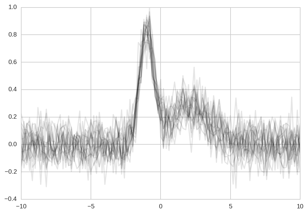
We start simulating N datasets which are identical except for the additive noise.
In [4]:
N = 20
In [5]:
x = np.linspace(-10, 10, 101)
In [6]:
peak1 = lmfit.models.GaussianModel(prefix='p1_')
peak2 = lmfit.models.GaussianModel(prefix='p2_')
model = peak1 + peak2
In [7]:
#params = model.make_params(p1_amplitude=1.5, p2_amplitude=1,
#                           p1_sigma=1, p2_sigma=1)
In [8]:
Y_data = np.zeros((N, x.size))
Y_data.shape
Out[8]:
(20, 101)
In [9]:
for i in range(Y_data.shape[0]):
    Y_data[i] = model.eval(x=x, p1_center=-1, p2_center=2,
                           p1_sigma=0.5, p2_sigma=1.5,
                           p1_height=1, p2_height=0.5)
Y_data += np.random.randn(*Y_data.shape)/10
In [10]:
plt.plot(x, Y_data.T, '-k', alpha=0.1);
Model Fitting
Single-peak model
Define and fit a single Gaussian model to the \(N\) datasets:
In [11]:
model1 = lmfit.models.GaussianModel()
In [12]:
Results1 = [model1.fit(y, x=x) for y in Y_data]
Two-peaks model
Here, instead, we use a more appropriate Gaussian mixture model.
To fit the noisy data, the residuals (the difference between model and data) is minimized in the least-squares sense.
In [13]:
params = model.make_params(p1_center=0, p2_center=3,
                           p1_sigma=0.5, p2_sigma=1,
                           p1_amplitude=1, p2_amplitude=2)
In [14]:
Results = [model.fit(y, x=x, params=params) for y in Y_data]
Fit results from an lmfit Model can be inspected with with
fit_report or params.pretty_print():
In [15]:
#print(Results[0].fit_report())
#Results[0].params.pretty_print()
This is good for peeking at the results. However, extracting these data from lmfit objects is quite a chore and requires good knowledge of lmfit objects structure.
pybroom helps in this task: it extracts data from fit results and returns familiar pandas DataFrame (in tidy format). Thanks to the tidy format these data can be much more easily manipulated, filtered and plotted.
Glance
A summary of the two-peaks model fit:
In [16]:
dg = br.glance(Results, var_names='dataset')

dg.drop('model', 1).drop('message', 1).head()
Out[16]:
| method | num_params | num_data_points | chisqr | redchi | AIC | BIC | num_func_eval | success | dataset | |
|---|---|---|---|---|---|---|---|---|---|---|
| 0 | leastsq | 6 | 101 | 1.101154 | 0.011591 | -444.394980 | -428.704257 | 53 | True | 0 |
| 1 | leastsq | 6 | 101 | 0.931581 | 0.009806 | -461.285248 | -445.594525 | 74 | True | 1 |
| 2 | leastsq | 6 | 101 | 0.755057 | 0.007948 | -482.504334 | -466.813611 | 73 | True | 2 |
| 3 | leastsq | 6 | 101 | 1.054727 | 0.011102 | -448.745702 | -433.054979 | 67 | True | 3 |
| 4 | leastsq | 6 | 101 | 0.955053 | 0.010053 | -458.771982 | -443.081259 | 74 | True | 4 |
A summary of the one-peak model fit:
In [17]:
dg1 = br.glance(Results1, var_names='dataset')

dg1.drop('model', 1).drop('message', 1).head()
Out[17]:
| method | num_params | num_data_points | chisqr | redchi | AIC | BIC | num_func_eval | success | dataset | |
|---|---|---|---|---|---|---|---|---|---|---|
| 0 | leastsq | 3 | 101 | 2.020585 | 0.020618 | -389.085081 | -381.239720 | 123 | True | 0 |
| 1 | leastsq | 3 | 101 | 1.809085 | 0.018460 | -400.252210 | -392.406849 | 79 | True | 1 |
| 2 | leastsq | 3 | 101 | 1.775647 | 0.018119 | -402.136536 | -394.291174 | 67 | True | 2 |
| 3 | leastsq | 3 | 101 | 1.669437 | 0.017035 | -408.366069 | -400.520707 | 47 | True | 3 |
| 4 | leastsq | 3 | 101 | 1.729501 | 0.017648 | -404.796055 | -396.950693 | 95 | True | 4 |
Tidy
Tidy fit results for all the parameters:
In [18]:
dt = br.tidy(Results, var_names='dataset')
Let’s see the results for a single dataset:
In [19]:
dt.query('dataset == 0')
Out[19]:
| name | value | min | max | vary | expr | stderr | init_value | dataset | |
|---|---|---|---|---|---|---|---|---|---|
| 0 | p1_amplitude | 0.970655 | -inf | inf | True | None | 0.138644 | 1.0 | 0 |
| 1 | p1_center | -1.048406 | -inf | inf | True | None | 0.044586 | 0.0 | 0 |
| 2 | p1_fwhm | 1.108958 | -inf | inf | False | 2.3548200*p1_sigma | 0.127077 | NaN | 0 |
| 3 | p1_height | 0.822276 | -inf | inf | False | 0.3989423*p1_amplitude/max(1.e-15, p1_sigma) | 0.076413 | NaN | 0 |
| 4 | p1_sigma | 0.470931 | 0.000000 | inf | True | None | 0.053965 | 0.5 | 0 |
| 5 | p2_amplitude | 1.125964 | -inf | inf | True | None | 0.211657 | 2.0 | 0 |
| 6 | p2_center | 1.882953 | -inf | inf | True | None | 0.369863 | 3.0 | 0 |
| 7 | p2_fwhm | 4.130409 | -inf | inf | False | 2.3548200*p2_sigma | 0.928058 | NaN | 0 |
| 8 | p2_height | 0.256094 | -inf | inf | False | 0.3989423*p2_amplitude/max(1.e-15, p2_sigma) | 0.034603 | NaN | 0 |
| 9 | p2_sigma | 1.754023 | 0.000000 | inf | True | None | 0.394110 | 1.0 | 0 |
or for a single parameter across datasets:
In [20]:
dt.query('name == "p1_center"').head()
Out[20]:
| name | value | min | max | vary | expr | stderr | init_value | dataset | |
|---|---|---|---|---|---|---|---|---|---|
| 1 | p1_center | -1.048406 | -inf | inf | True | None | 0.044586 | 0.0 | 0 |
| 11 | p1_center | -0.889667 | -inf | inf | True | None | 0.042930 | 0.0 | 1 |
| 21 | p1_center | -1.017563 | -inf | inf | True | None | 0.049224 | 0.0 | 2 |
| 31 | p1_center | -0.985135 | -inf | inf | True | None | 0.039416 | 0.0 | 3 |
| 41 | p1_center | -0.945191 | -inf | inf | True | None | 0.049017 | 0.0 | 4 |
In [21]:
dt.query('name == "p1_center"')['value'].std()
Out[21]:
0.048856352386558416
In [22]:
dt.query('name == "p2_center"')['value'].std()
Out[22]:
0.25202595757427243
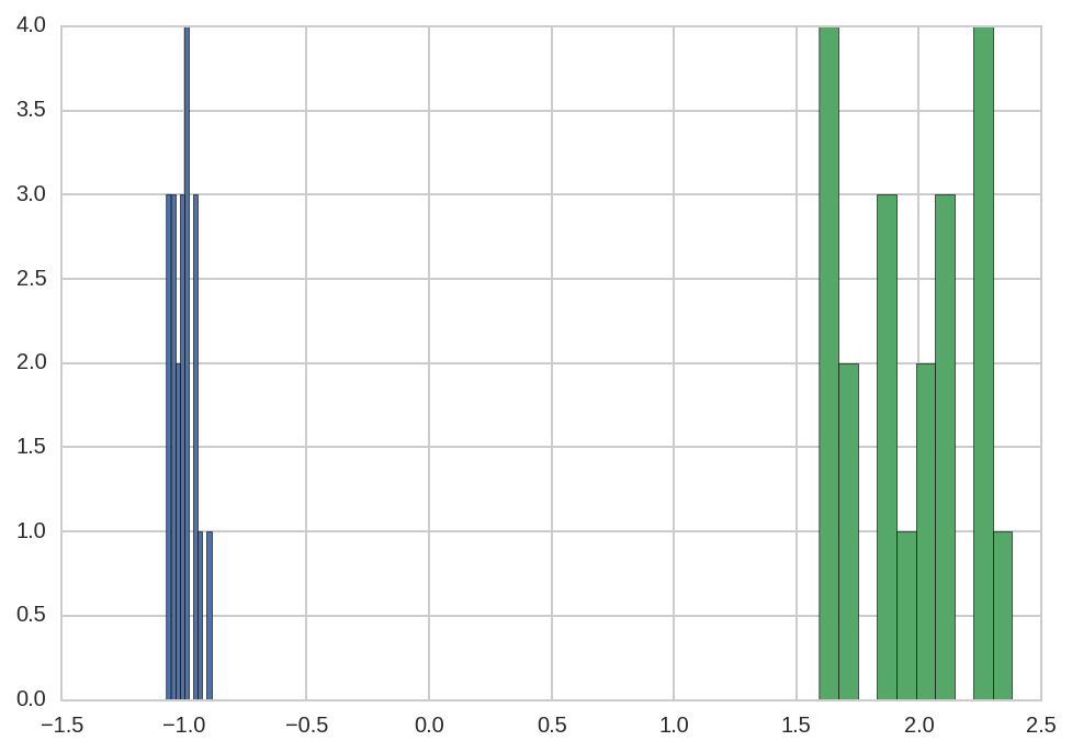
Note that there is a much larger error in fitting p2_center than
p1_center.
In [23]:
dt.query('name == "p1_center"')['value'].hist()
dt.query('name == "p2_center"')['value'].hist(ax=plt.gca());
Augment
Tidy dataframe with data function of the independent variable (‘x’). Columns include the data being fitted, best fit, best fit components, residuals, etc.
In [24]:
da = br.augment(Results, var_names='dataset')
In [25]:
da1 = br.augment(Results1, var_names='dataset')
In [26]:
r = Results[0]
Let’s see the results for a single dataset:
In [27]:
da.query('dataset == 0').head()
Out[27]:
| x | data | best_fit | residual | Model(gaussian, prefix='p1_') | Model(gaussian, prefix='p2_') | dataset | |
|---|---|---|---|---|---|---|---|
| 0 | -10.0 | -0.158792 | 2.767789e-11 | 0.158792 | 2.860223e-79 | 2.767789e-11 | 0 |
| 1 | -9.8 | 0.033922 | 5.953755e-11 | -0.033922 | 8.378007e-76 | 5.953755e-11 | 0 |
| 2 | -9.6 | -0.118625 | 1.264161e-10 | 0.118625 | 2.049043e-72 | 1.264161e-10 | 0 |
| 3 | -9.4 | -0.054113 | 2.649522e-10 | 0.054113 | 4.184382e-69 | 2.649522e-10 | 0 |
| 4 | -9.2 | 0.031254 | 5.481333e-10 | -0.031254 | 7.134789e-66 | 5.481333e-10 | 0 |
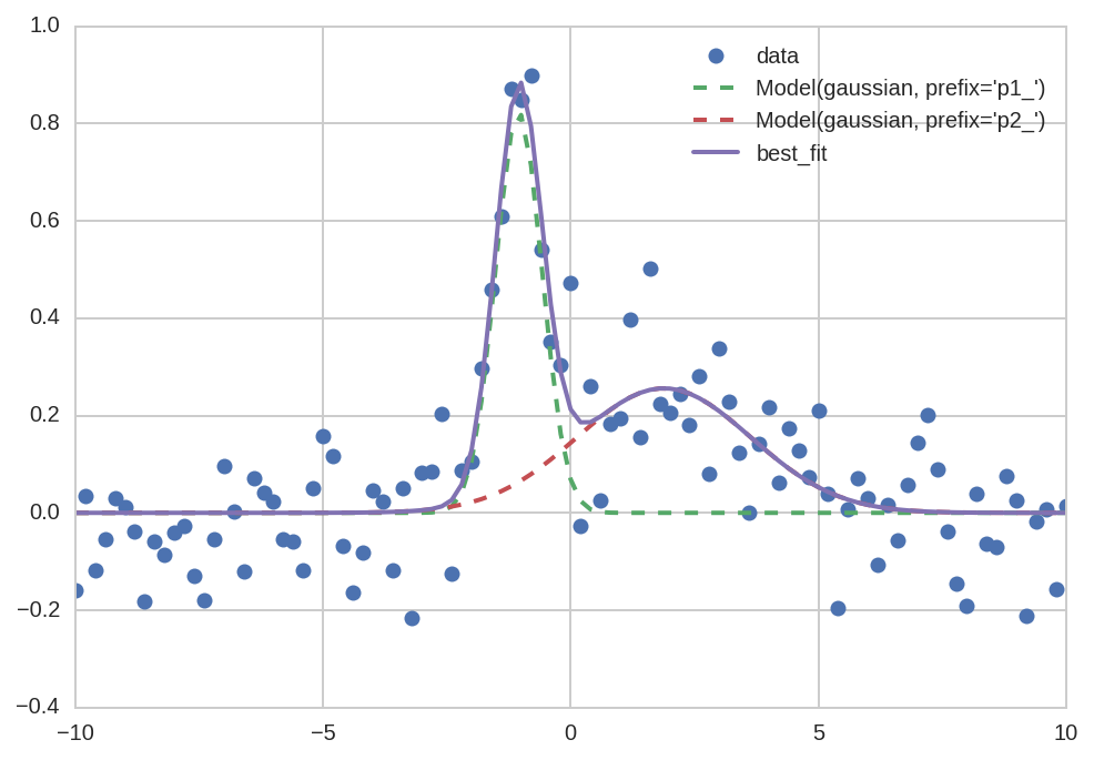
Plotting a single dataset is simplified compared to a manual plot:
In [28]:
da0 = da.query('dataset == 0')
In [29]:
plt.plot('x', 'data', data=da0, marker='o', ls='None')
plt.plot('x', "Model(gaussian, prefix='p1_')", data=da0, lw=2, ls='--')
plt.plot('x', "Model(gaussian, prefix='p2_')", data=da0, lw=2, ls='--')
plt.plot('x', 'best_fit', data=da0, lw=2);
plt.legend()
Out[29]:
<matplotlib.legend.Legend at 0x7fa0d7defc18>
But keep in mind that, for a single dataset, we could use the lmfit method as well (which is even simpler):
In [30]:
Results[0].plot_fit();
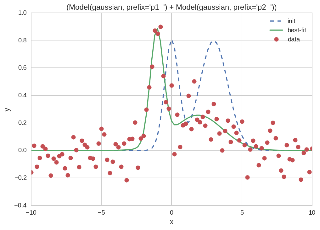
However, things become much more interesting when we want to plot multiple datasets or models as in the next section.
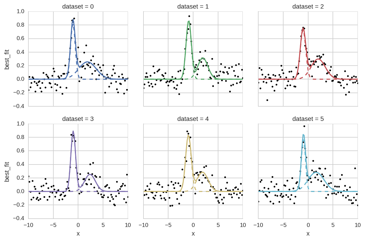
Comparison of different datasets
In [31]:
grid = sns.FacetGrid(da.query('dataset < 6'), col="dataset", hue="dataset", col_wrap=3)
grid.map(plt.plot, 'x', 'data', marker='o', ls='None', ms=3, color='k')
grid.map(plt.plot, 'x', "Model(gaussian, prefix='p1_')", ls='--')
grid.map(plt.plot, 'x', "Model(gaussian, prefix='p2_')", ls='--')
grid.map(plt.plot, "x", "best_fit");
Comparison of one- or two-peaks models
Here we plot a comparison of the two fitted models (one or two peaks) for different datasets.
First we create a single tidy DataFrame with data from the two models:
In [32]:
da['model'] = 'twopeaks'
da1['model'] = 'onepeak'
da_tot = pd.concat([da, da1], ignore_index=True)
Then we perfom a facet plot with seaborn:
In [33]:
grid = sns.FacetGrid(da_tot.query('dataset < 6'), col="dataset", hue="model", col_wrap=3)
grid.map(plt.plot, 'x', 'data', marker='o', ls='None', ms=3, color='k')
grid.map(plt.plot, "x", "best_fit")
grid.add_legend();
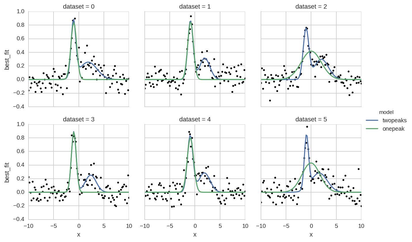
Note that the “tidy” organization of data allows plot libraries such as seaborn to automatically infer most information to create complex plots with simple commands. Without tidy data, instead, a manual creation of such plots becomes a daunting task.